Koa Koa
Koa Koa product range had evolved in the last few years and their previous graphic identity didn't correspond with their current mission or ethos anymore.
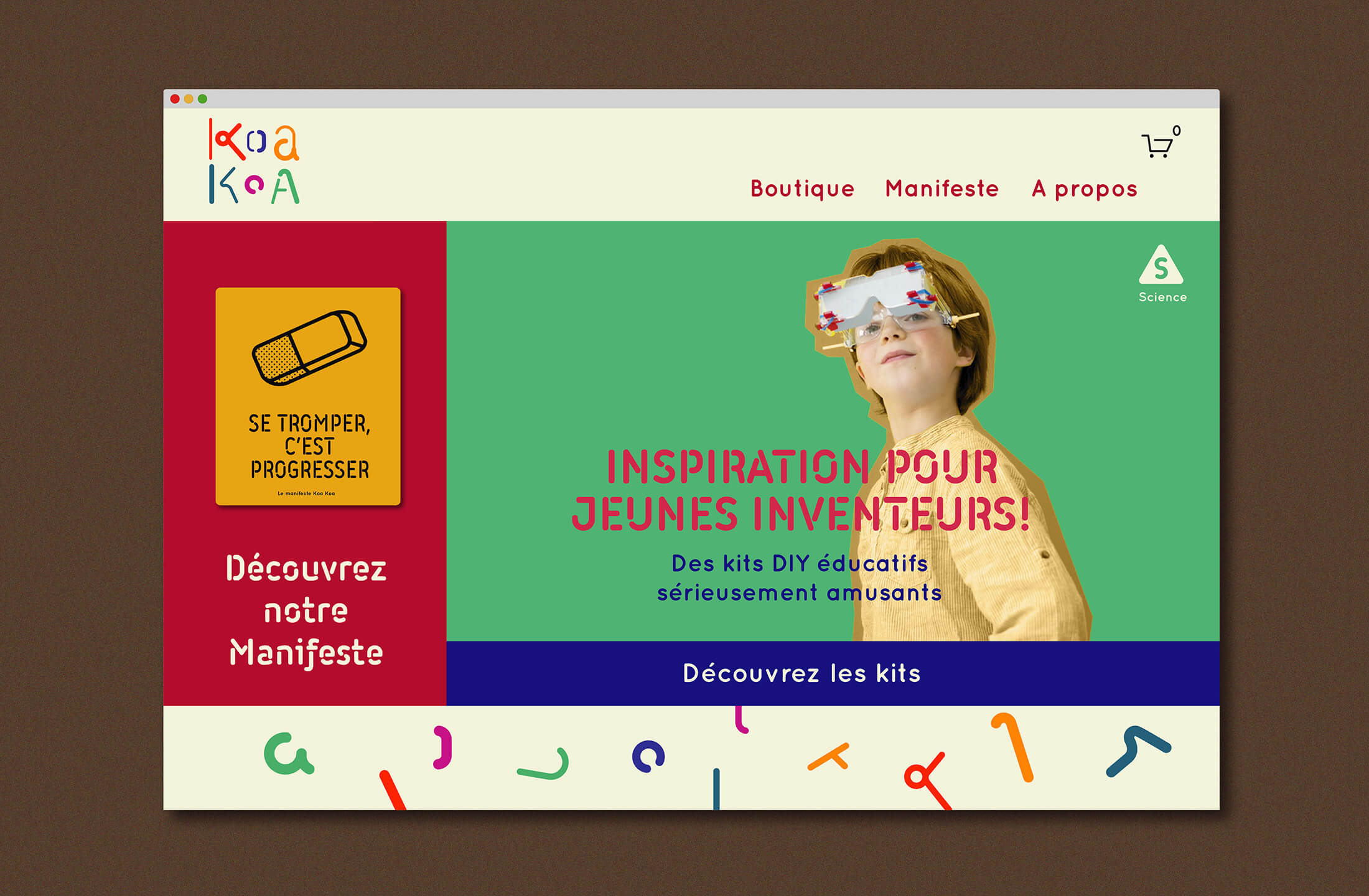
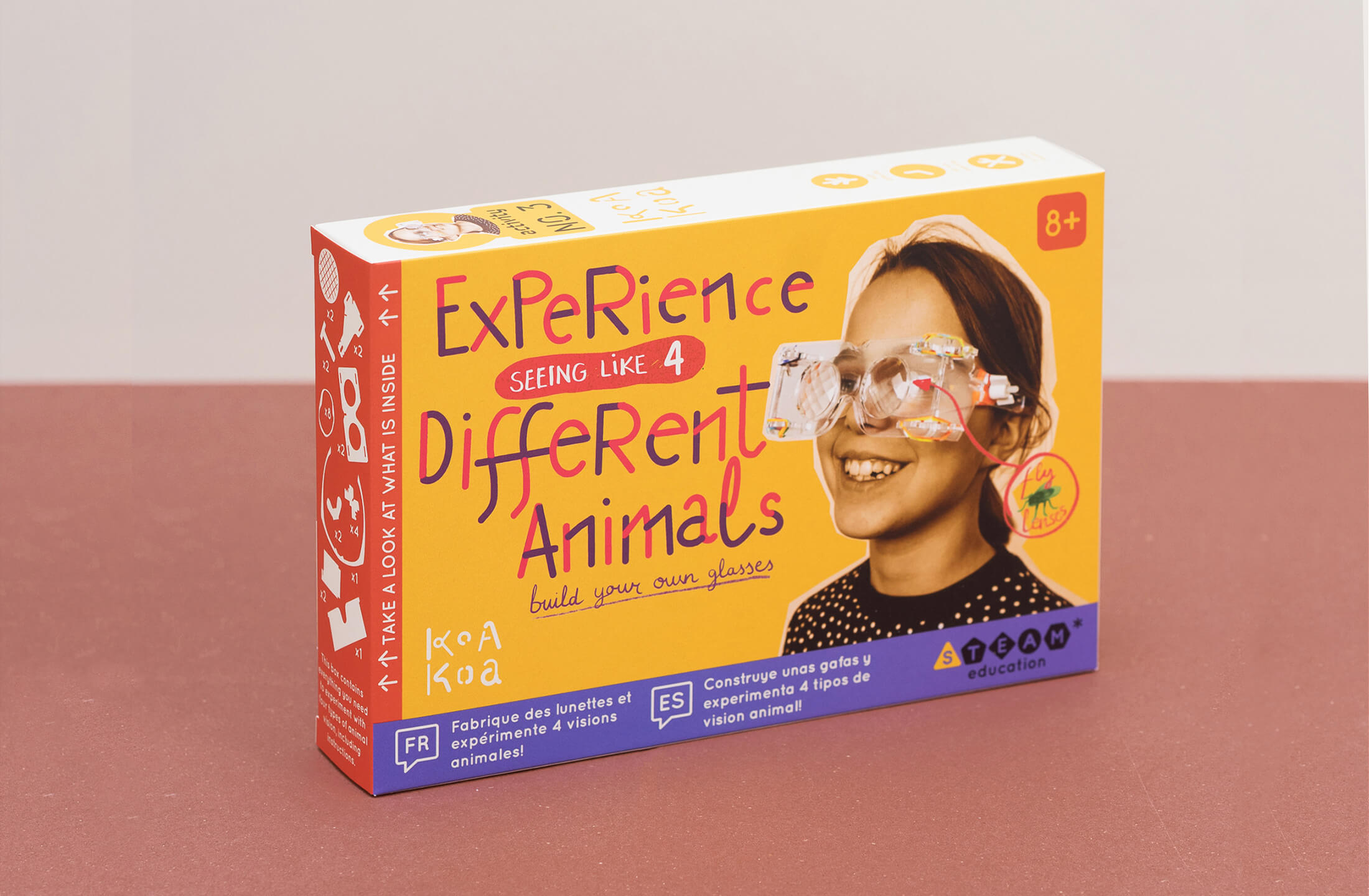
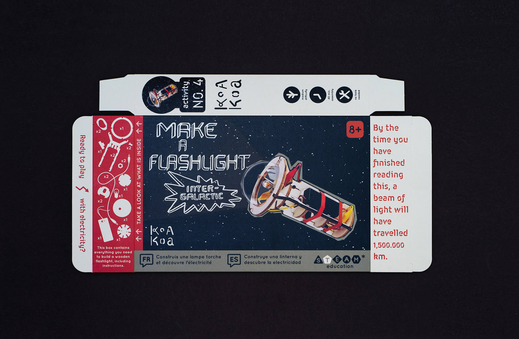
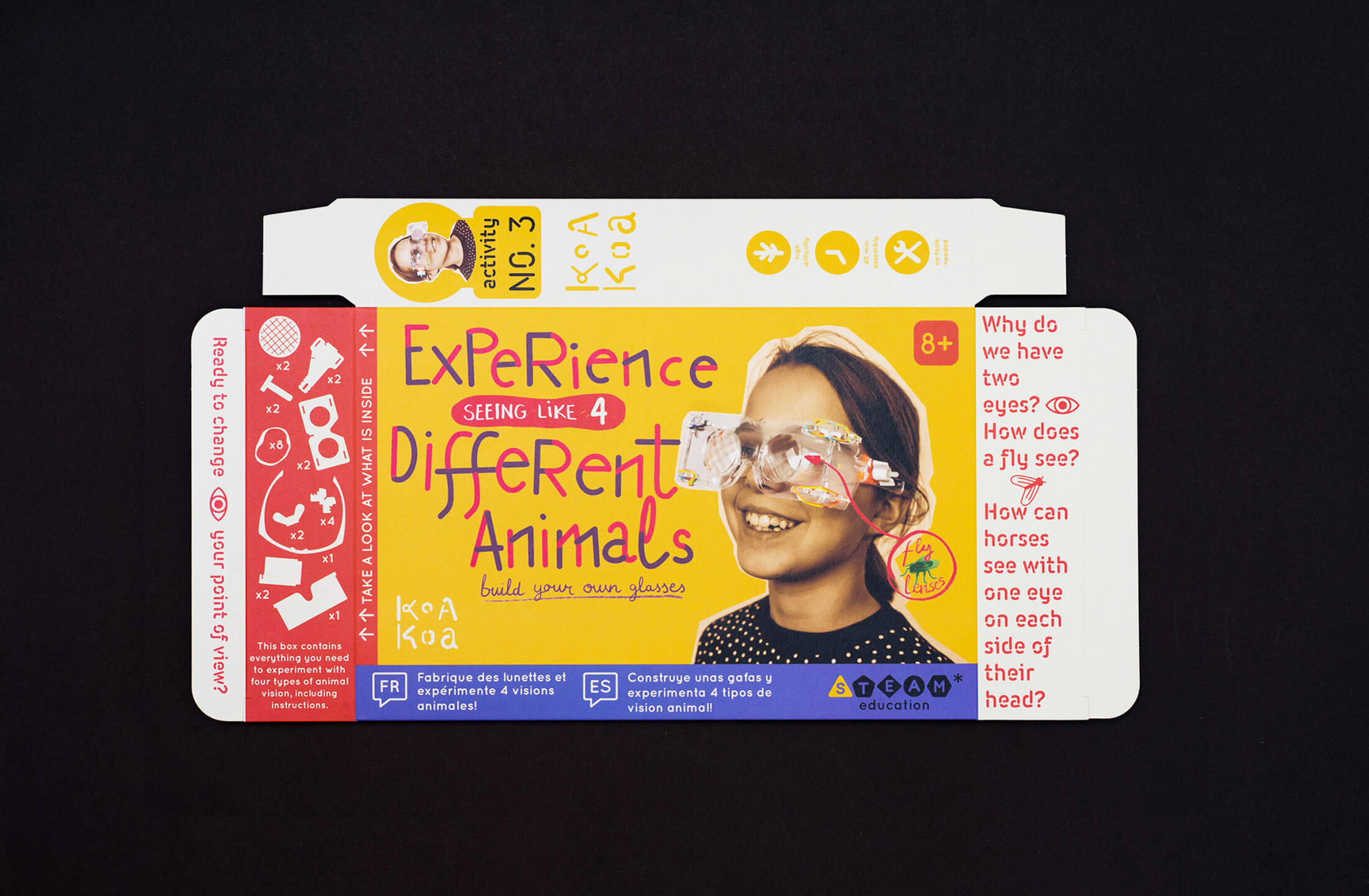
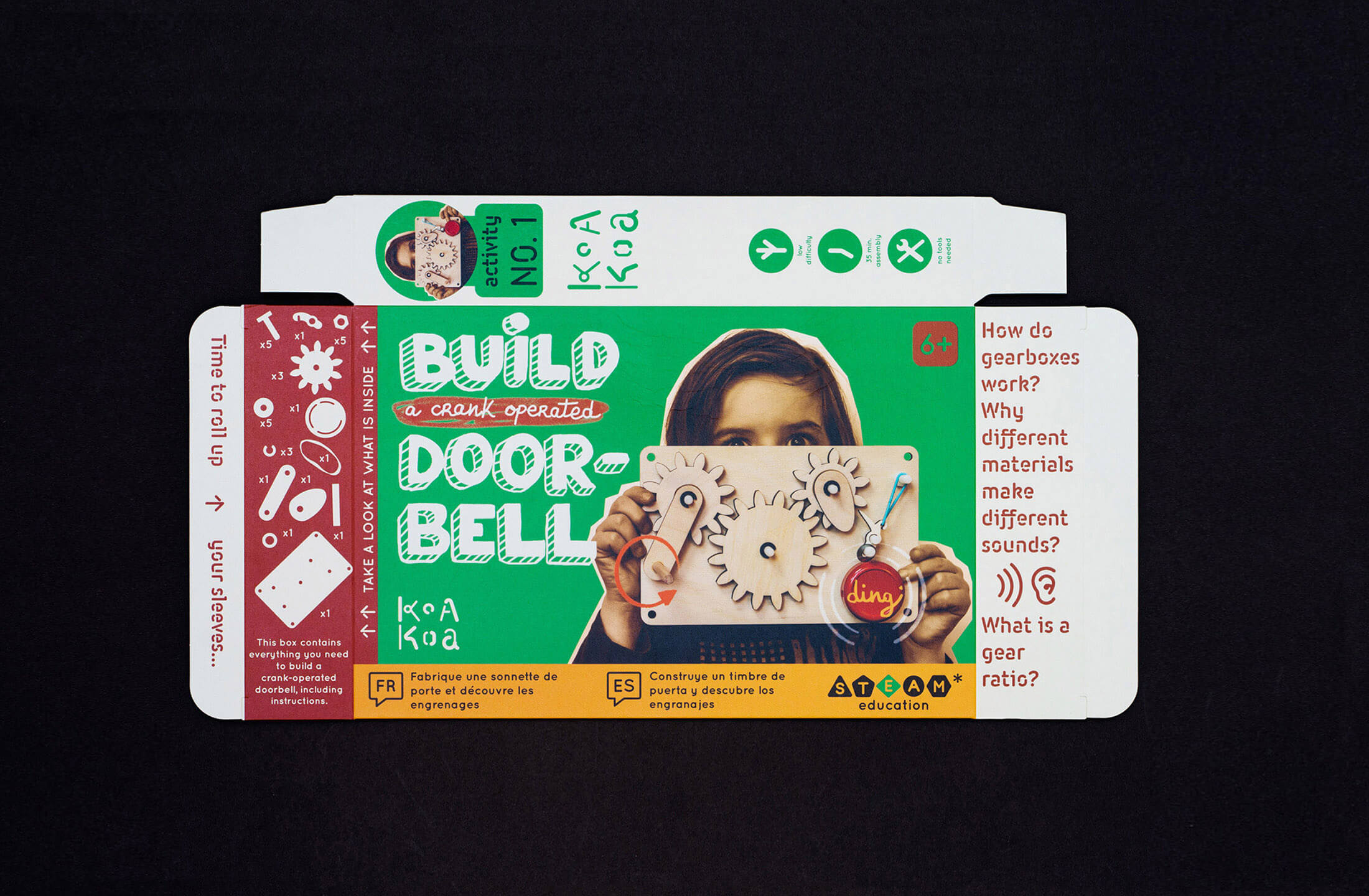
The new design communicates the idiosyncratic and DIY character of Koa Koa activities through the use of a stencil font for the headers and a more vibrant colour palette.
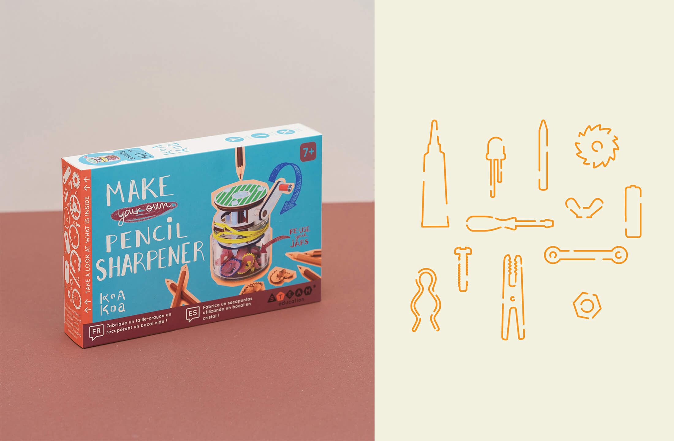
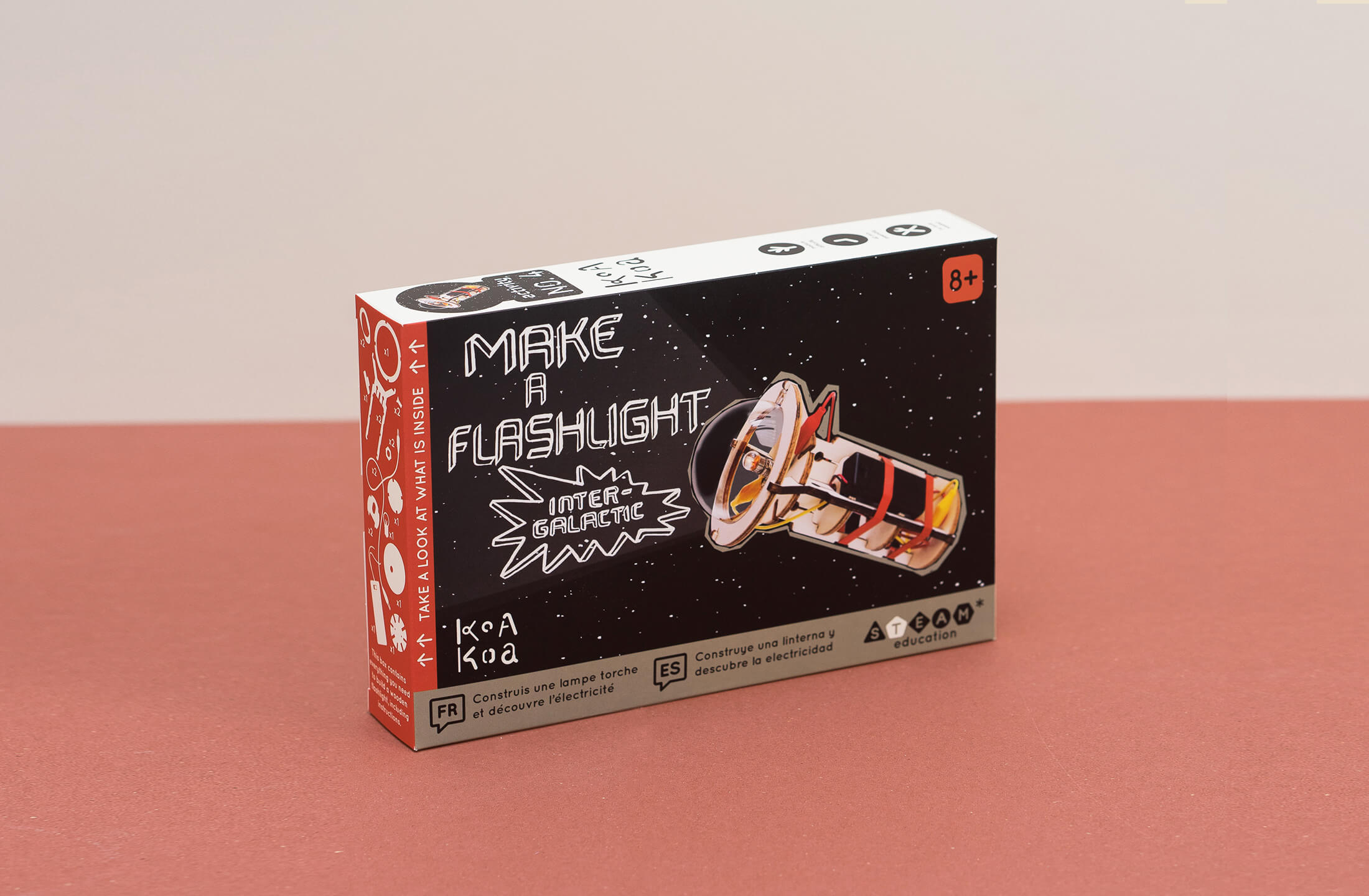
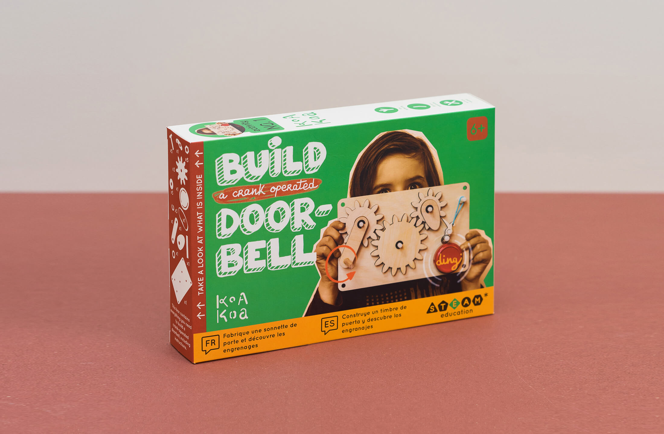
The hands on approach is reflected both on the informal hand drawn lettering on the packaging and the more geometric stencil font.
The logotype is composed of disjointed forms in reference to the brand DIY kits and can be used as a branding pattern across different media.
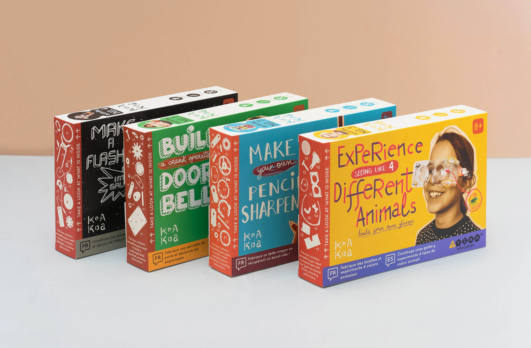
Based on a dynamic grid, three colour contrasting content blocks define the main graphic structure which is applied to the Koa Koa website, packaging and printed booklets.
The identity will be gradually rolled out, and has been already applied to the packaging, and collateral elements. The new retail packaging comes in three languages (FR/EN/ES).
Koa Koa product range had evolved in the last few years and their previous graphic identity didn't correspond with their current mission or ethos anymore.
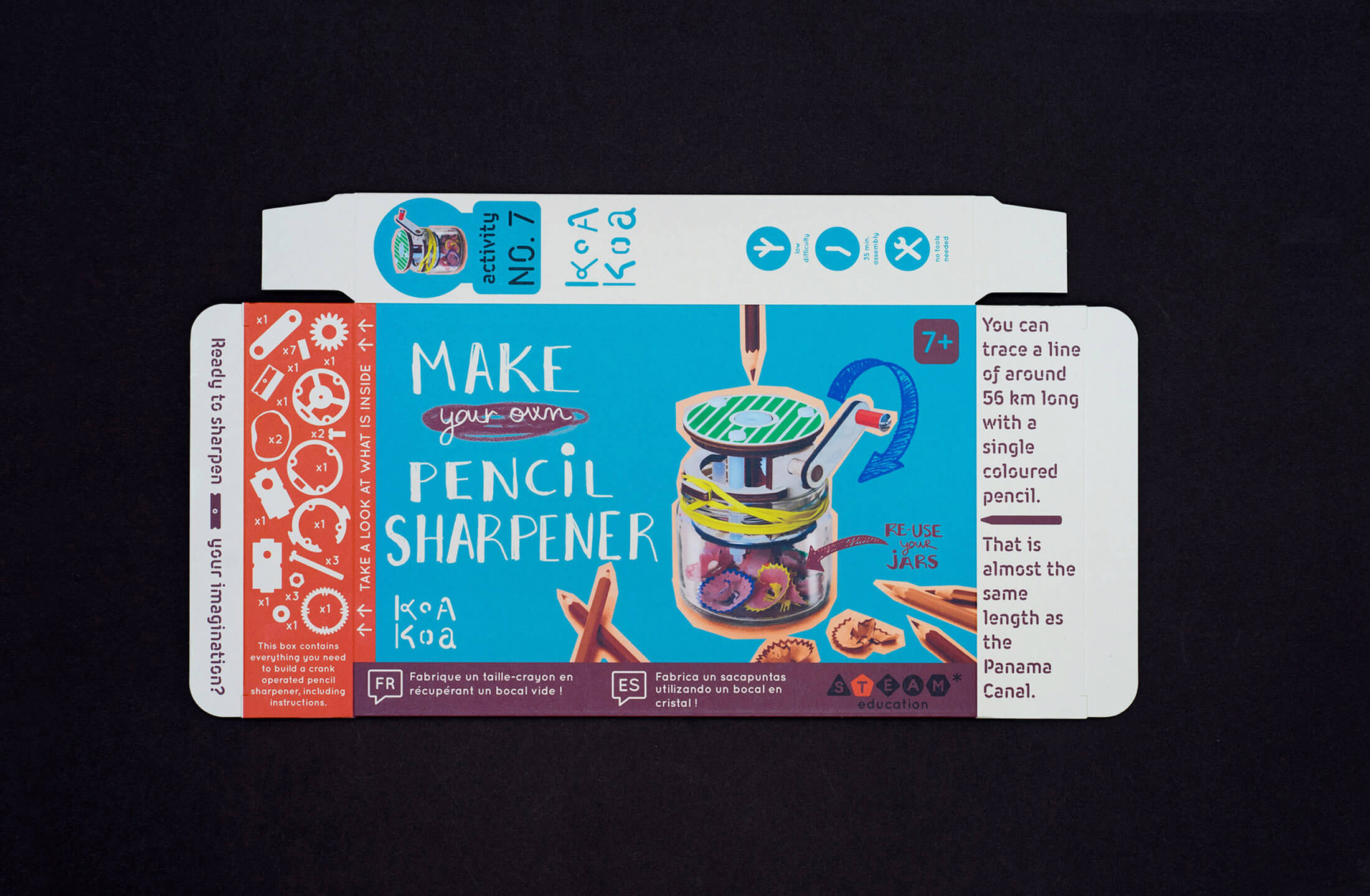
The new brand communicates the idiosyncratic and DIY character of Koa Koa activities through the use of a stencil font for the headers and a more vibrant colour palette.
The maker, hands on approach is reflected both on the informal hand drawn lettering on the packaging and the more geometric stencil font.
The new logotype is composed of disjointed forms in reference to the brand product kits and will be also used as a branding pattern across different media.
Based on a dynamic grid, three colour contrasting content blocks define the main graphic structure which is applied to the Koa Koa website, packaging and printed booklets.
The identity will be gradually rolled out, and has been already applied to the packaging, and collateral elements. The now retail packaging comes in three languages (FR/EN/ES).
Koa Koa product range had evolved in the last few years and their previous graphic identity didn't correspond with their current mission or ethos anymore.
The new brand communicates the idiosyncratic and DIY character of Koa Koa activities through the use of a stencil font for the headers and a more vibrant colour palette.
The maker, hands on approach is reflected both on the informal hand drawn lettering on the packaging and the more geometric stencil font.
The new logotype is composed of disjointed forms in reference to the brand product kits and will be also used as a branding pattern across different media.
Based on a dynamic grid, three colour contrasting content blocks define the main graphic structure which is applied to the Koa Koa website, packaging and printed booklets.
The identity will be gradually rolled out, and has been already applied to the packaging, and collateral elements. The now retail packaging comes in three languages (FR/EN/ES).
Related URL: www.koakoa.fr
Date: 2020